
When I told friends that my debut novel, Truestory, was going to be published one of the most common reactions was: ‘But what about the cover?’
I admit it had been on my mind too. However, I’m a writer, not a jacket designer, so the cover wasn’t up to me. This was a good job because I wouldn’t have had a clue how to create a decent cover despite studying thousands in bookshops over the years and being seduced by quite a few – reading many a book purely based on the allure and promise of the cover.
While writing Truestory I created a Pinterest board for my novel and recurring themes on there were the rural setting, silhouettes and the hint of illicit sexual goings on – so ideally, I knew the cover would incorporate these elements, somehow or other. I never had that conversation with anyone though.
A couple of months after signing the contract with my publisher, Sandstone Press, I received an email from them with the subject line: Truestory cover. I was gripped by excitement and fear. This was much sooner than I’d expected. What if I didn’t like it? What if I hated it?
My daughter was sitting beside me at the kitchen table as I opened the email and I don’t think either of us breathed as we waited for the attachment to flicker into life. When it did, I could see instantly that the cover was perfect.
‘I love it!’ I said, almost bursting into tears of relief, while my daughter said: ‘That’s cool.’
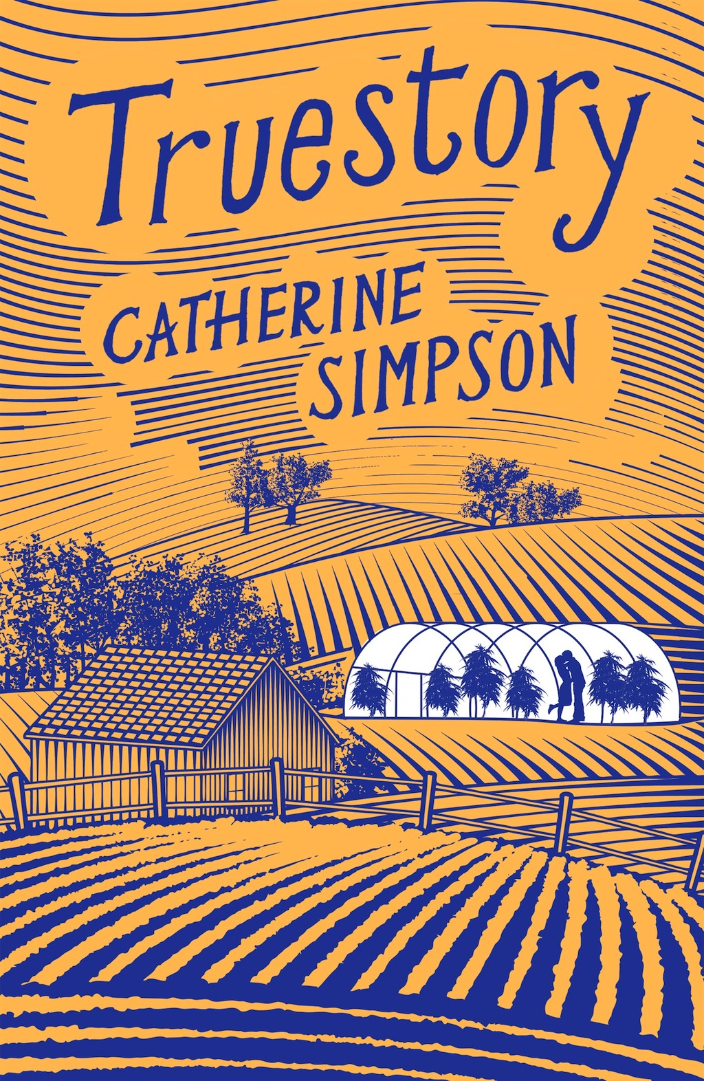
The rural setting was there in spades, the typeface was beautiful and my name was BIG (I’m not a narcissist, but well, it’s nice), and most importantly right in the middle – small and not immediately noticeable – was a silhouette of a cuddling couple inside a polytunnel (you’ll have to read it)!
The naïve woodcut style was just right for the pared-down tone of the book. The designer had encapsulated the setting, the plot and the mood perfectly – and I loved the striking blue and yellow colours.
I googled Jon Gray, the designer and saw what wonderful company my book was in – Gray318 has designed covers for, among others, Jonathan Safran-Foer, Jonathan Lethem and Zadie Smith, for goodness sake.
I asked Sandstone how they got it so right. My editor, Moira Forsyth, explained that Sandstone tried to match up the designer with the book – but the really important thing was that they had access to a number of great designers. She had sent a brief to the designer which included a short synopsis and some key images for him to work with, plus technical information about the book’s format. The text was also made available.
Moira said: ‘Book design is always tricky! Some designers get it right immediately – Jon Gray is one of those.’
The cover has been my screen saver for the past nine months and I’m not fed up with it yet – I can’t imagine ever getting tired of it – I still think it’s delicious.
Truestory is published on 17 September 2015. You can order your copy here.
Catherine Simpson has been shortlisted in the Mslexia Novel Award, the Asham Award, Bristol Short Story Prize and Bath Short Story Award. Her work has featured in anthologies and she has performed it at various festivals (including Edinburgh International Book Festival) and on BBC radio. She was named as one of Edinburgh UNESCO City of Literature’s emerging writers in both 2012 and 2013. Her journalism has appeared in The Scotsman, The Herald, The Daily Mail, The Sun and magazines. In 2013, she won a Creative Scotland New Writers Award for the opening chapters of Truestory. She lives near Edinburgh with her husband and two teenage daughters.


No comments!
There are no comments yet, but you can be first to comment this article.